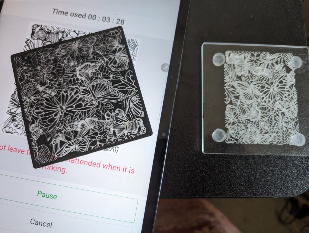
So all the failed photo attempts that I tried with glass was because of grayscale. Glass is an all black & white medium. I couldn’t figure out why the text on all my failed glass tries looked so good, but the picture always looked so bad. Now I know. If you want a coaster with an actual picture on it, I’m definitely going to point you in the direction of slate.
All three of these were burned from the same graphic. If you want photo realism, I’d definitely encourage you to go with slate!